Brandgility October Release: Whats New?
November 5th, 2025
Written by: Rob Atkinson, Product Specialist
Platform Highlights
Shared Order History
The Order History function has been enhanced to allow for orders to be shared between users who have access to the same common user grouping, such as a property code, a location code or a brand id. etc.
This new sharing functionality is controlled at the account level by a module switch. It also requires configuration to define which user profile attribute is to be used to filter and match orders, placed by another user.
The “Shared Orders” functionality (when switched on) is accessible via the “All Orders” dropdown option, visible on the Order History list. When this dropdown option is selected, the My Orders view is refreshed to show All Orders that match the defined criteria i.e. the property code on your user profile being found and matched on any other user’s orders (in the appropriate configured attribute).
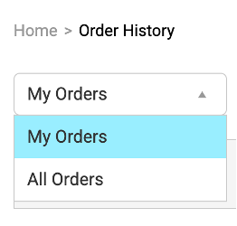
A shared order which is displayed on the All Orders view is then available to be previewed, downloaded and reconfigured (for reorder) as required, by any user who can see it.
Shared Download History
The Download History function has been enhanced to allow for downloads to be shared between users who have access to the same common user grouping, such as a property code, a location code or a brand id. etc.
This new sharing functionality is controlled at the account level by the same module switch. It also uses the same configuration as the Order History sharing, to define which user profile attribute is to be used to filter and match downloads, requested by another user.
The “Shared Downloads” functionality (when switched on) is accessible via the “All Downloads” dropdown option, visible on the Download History list. When this dropdown option is selected, the My Downloads view is refreshed to show All Downloads that match the defined criteria i.e. the property code on your user profile being found and matched on any other user’s downloads (in the appropriate configured attribute).
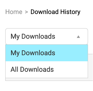
Any shared download which is displayed on the All Downloads view is then available to be previewed, downloaded and reconfigured (for download) as required, by any user who can see it.
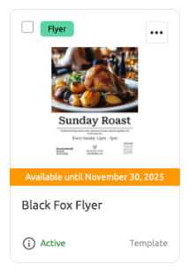
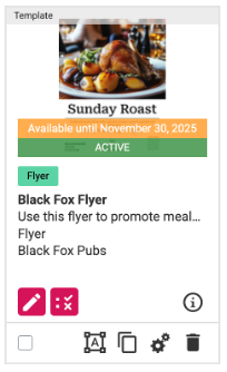
Expiry Date Flash
If the expiry date functionality is enabled, then any asset with an upcoming expiry date is highlighted with a new orange flash showing on the asset.
If the new UI is being used, then these appear as follows:
If the old UI is still being used, then it is shown as:
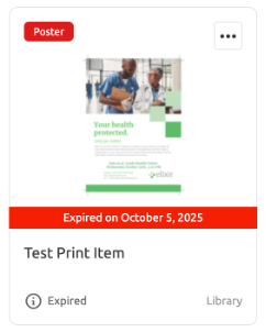
Expired assets are only visible to users with the Manage Assets permission. If the new UI is being used, then these are highlighted with a red flash, as follows:
If the old UI is still being used, then it is shown as:
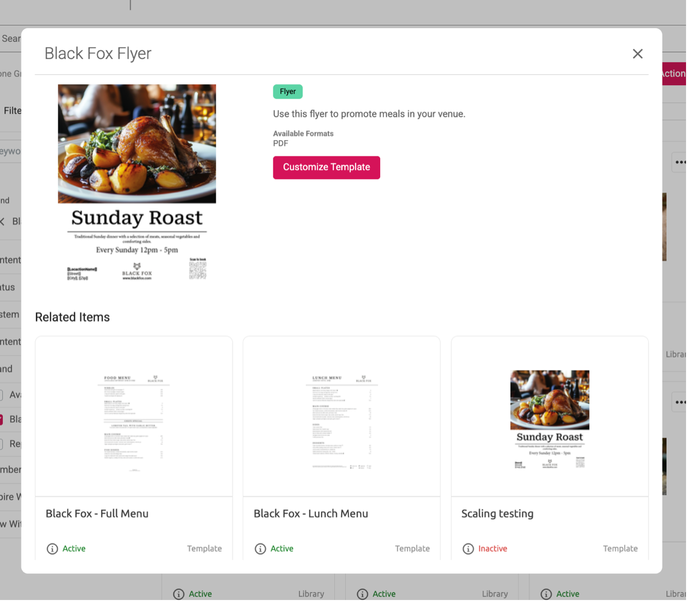
Managing Assets in Campaigns
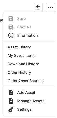
A new Manage Assets option has been added to the ellipse options of a Campaign
When selected, a “select asset” flyout is shown, allowing assets to be selected (added) or deselected (removed) from the campaign. When finished and the OK option is clicked, the Campaign is redisplayed with the changes are applied.
Related Items
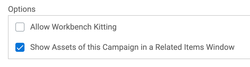
A new “related items” feature is available when using content placed in a Campaign.
To control this functionality, a new setting is visible in the options of a Campaign as follows:
An enhancement to our search engine means users can now search their orders by specific fields, for example order reference, Asset Name, Status, etc.
When the above option is checked (and only when the new UI is being used), then the related items functionality can be triggered. This happens whenever an asset inside the campaign is selected from the Asset library for customisation or preview.
The related item window appears as follows:

This shows details about the selected item at the top and also lists any other related item (taken from the same campaign). The user can choose to continue by selecting the “customise” (or “preview“) option. Alternatively, they can choose to select from any of the other related items instead.
To disable the related item functionality for the campaign, simply uncheck the new Campaign option.
Home Navigation Menu
A new Home Navigation Menu function is available for use. This is accessed when a user clicks the Home icon which is showing in the page header:
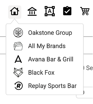
When clicked, a dropdown of sub-pages is shown. These are sub-pages which have been nominated as being part of the Home Navigation Menu (see below for how to nominate a sub-page to appear on this list).
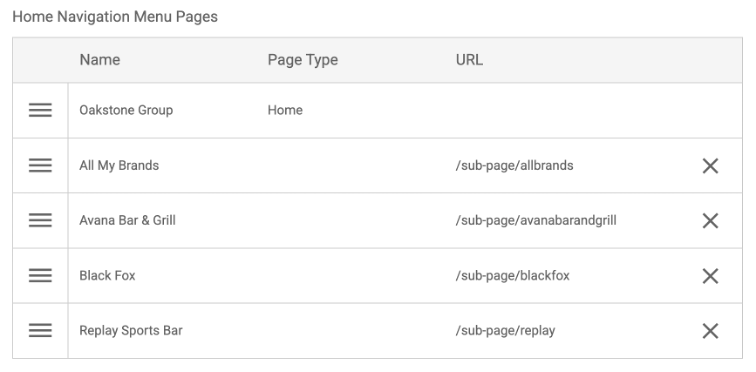
The list of sub-pages can be organised into the required order on the Home page configuration using the Home Navigation Menu Pages control:
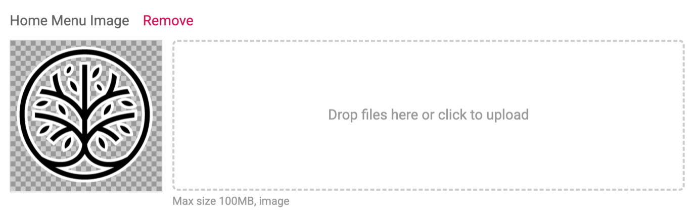
Additionally, the icon to be shown for the Home page option can also be uploaded.
Nominated Sub-pages
To nominate a sub-page to appear in the Home Navigation Menu, check the new “Show Page in Home Navigation Menu” option found in the Page options of the sub-page. This is available to be checked on any sub-page:

In addition, it is possible to control who can see a nominated sub-page. This is done by setting the Role table, which appears in the configuration of all sub-pages.:
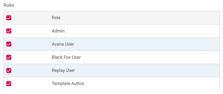
Only users who have a role which is checked on a sub page can see the sub-page. This also applies to sub-pages which are nominated to appear in the Home Navigation Menu.
Controlling access to the Home page
Where home page overrides are being used to direct a user to a specific sub-page on login, the Home page is typically restricted from being accessed. So, when a user tries to click the main logo or the Home icon, then they are automatically redirected to their home page override sub-page.
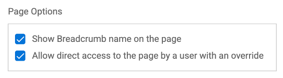
When the Home Navigation Menu is being used, then the Administrator can allow users to click the Home option within the Home Navigation menu and allow users to gain access to the Home page. This is done by checking the “Allow direct access to the page by a user with an override” setting on the Home page Page options
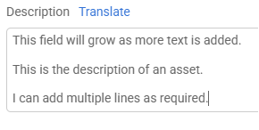
Text field behaviour
Where possible, a new format of text field has been introduced.
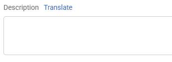
Previously, the multi-line text fields were displayed as a fixed size and did not adjust (grow or reduce) as text was being entered/altered, as shown below:
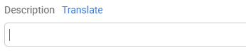
Where possible, these fields have been replaced with a more flexible format, that can grow or reduce as the text is entered or adjusted. The field starts as a single line:
But as text is added, it will grow to show this:
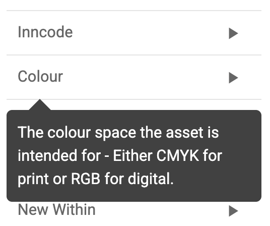
Hover Help
Hover help has been introduced on the Asset library. This is shown when hovering on a search Facet, as shown below for the Paper size attribute:
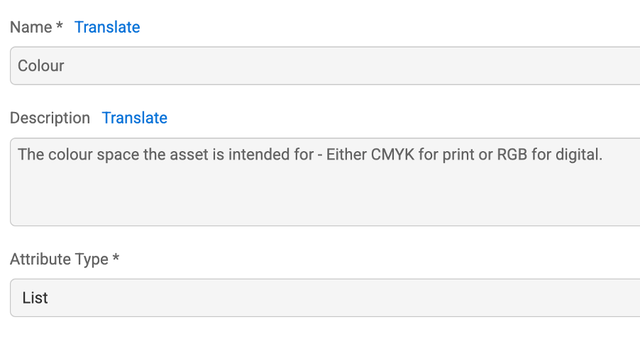
The text for the Hover help must be entered into the attribute description field:
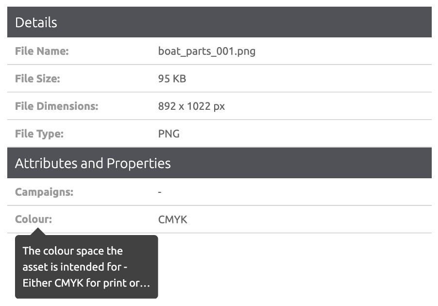
The same Hover help is also displayed on the Asset details screen, when hovering on an attribute, as shown for the
Paper size attribute, as follows:
Template Studio Highlights
Show page numbers on variable page templates
We’ve added the ability to include page numbers on templates with a variable number of pages. To use the feature, create a placeholder and add it to each page you’d like the page number to be shown on. Then turn on the page number option for the placeholder. The value of the placeholder will then automatically be set to the correct page number based on the number of visible pages.

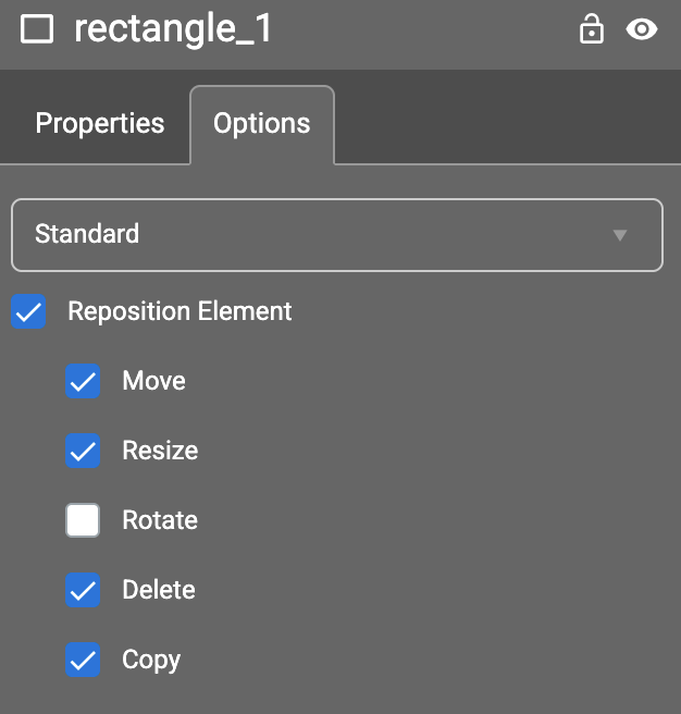
Allow users to duplicate and delete shape elements
There are new options on shape elements to allow end users to duplicate and delete shape elements during customization.
Sign up for blog updates
Fill out the form below to receive blog updates to help you streamline your brand asset management
Like to learn more about how Brandgility can help your organization?
Book a discovery call today